Sunday, October 31, 2010

Rally For Sanity vs. Red Dawn


I didn't get down to D.C. for Jon Stewart's Rally to Restore Sanity, but I hate crowds like that anyway. I did see a number of pictures from the event online, especially at the Huffington Post, where the coverage was breathless. Most interesting, to me, were the signs people were carrying, especially when compared to the signs waved at Tea Party rallies, where the words  "exaggerated hyperbole" are used sparingly, if at all.


Honestly, signs like that will probably not ignite a groundswell of action, and maybe that's the point, but if so it's a weird goal for a big rally.

Don't get me wrong: I'm sick of the lava that flows from Glenn Beck, and I don't care if I never see another Tea Party sign about Americans being under the boot heel of a tyrant in the White House. Who the Tea Party hopes to turn out of office. At the polls. In two years.

Which brings me to something I thought of yesterday as I was channel surfing. With the mid-term elections only days away, I'm pretty sure I finally have a visual handle to understand the passionate intensity of the Tea Partiers and all their signs about tyranny.

Back in the 1984, with Ronald Reagan in the White House, no one seemed to worry much about home-grown tyranny. We were more scared of the Russians, and our fears were amply rewarded with the movie Red Dawn, in which a young Patrick Swayze and Charlie Sheen fight back against Soviet and Cuban troops who invade Colorado. There is much anger and lamenting that fact that no one took the Communists seriously until everyone had been enslaved by them.

As I was watching it on Saturday, I realized that if you replace the words "Russian" and "Cuban" with "Democrats" and "Obama" you pretty much have a Tea Party rally attended by Charlie Sheen. Which is a rally I'd go to.

Try making a good movie about exaggerated hyperbole.

The teenagers in Red Dawn live in an occupied zone controlled by the Reds. The Tea Partiers today live in an occupied zone controlled by liberals, Wall Street, the IRS, and shadowy special interests. If I were a smart movie executive, I'd be making a Red Dawn sequel right now.

Oops, I'm too late. Again. There is a remake, in which the Chinese take over Michigan, or some place like that where the militias are ready to go. What timing. Here's a trailer:

Friday, October 29, 2010

Hands-On Politics: Clinton and Palin Get Touchy

Did former president Bill Clinton privately ask Kendrick Meek, the Democrat running for senate in Florida to step out of the race and endorse independent candidate Charlie Crist?

Will Sarah Palin's upgraded endorsement of Republican senate candidate Joe Miller revive his sagging campaign?

These two intriguing questions, coming from opposite corners of the country, come amid uncertain polling and TV-ad blitzes marking the end of the 2010 mid-term election. Visually, they are represented in these two pictures, both from today's New York Times:

Meek and Clinton, by John Raoux/AP
 This is Clinton, arm-in-arm with Meek at a Orlando campaign stop, in a photo by John Raoux for Associated Press. According to reports, the former president asked Meek to leave the three-way race for senate in order to clear the path for Crist, a former moderate Republican governor who was defeated in his party's primary by the more conservative Marco Rubio. Apparently, Meek has decided to stay in the race. The image belies the back-room deal-making; the traditional political embrace is a visual message only, as if often the case.

Miller and Palin, by John Moore/Getty Images
Palin's touch in Alaska may be deft, or daft. Her initial Facebook endorsement of Tea Partier Miller helped him oust Senator Lisa Murkowski, Palin's queen-bee political rival, in the Republican primary, and that seemed deft at the time. But Murkowski started a write-in campaign and the bearded Miller started emitting vibes weird even by the standards of Alaska, or Florida, or New York, or Arizona, or Nevada. Maybe especially Nevada. Or Kentucky.

In this picture, Palin lays on some skin in person, another piece of political theater meant for the cameras only.

While the images--or the events the images document--may be disingenuous, they both represent endgame moments in a fractured, unpredictable political season. We can simply view them as such.

Thursday, October 28, 2010

There is Nothing Simple About National Geographic Beauty


Swimmer at Pool of Victoria Falls, Zambia, by Annie Griffiths
 What do you call a book filled with photographs whose only unifying theme seems to be that they are rather breathtaking? You can almost hear the queasy fatigue in the voices of the editors tasked with coming up with a title. Someone suggests they just call it “Simply Beautiful.” Okay, it’s fine. Now, lunch.
     Perhaps I’m being too hard on the editors at National Geographic Books, which just released National Geographic Simply Beautiful Photographs.The book is a collection of images from the Geographic Image Collection, and it comes with an exhibition at the National Geographic Museum in Washington, D.C. I haven’t seen that show, but I did attend the opening of the “Simply Beautiful” exhibition at New York’s Steven Kasher Gallery last week.

Trumpeter Swan, Yellowstone National Park, by James P. Blair
 Let me be very clear in saying that these are remarkable pictures by many of my favorite photographers: Sam Abel, Jodi Cobb, David Doubilet, Annie Griffiths, and Beverly Joubert, to name a few.
      As you can see from the samples I’ve included here, the pictures are beautiful…at least they satisfy my general requirements for beauty in a photograph. Are they simple? Only if you ignore the work and expertise that went into making the pictures look easy. Snapshots they aren’t.

Woman Reading a Greeting Card Designed as a Newspaper, Florence, Italy, by Jodi Cobb
When I saw the work at Kasher, though, I couldn’t help but wonder: How much beauty is too much? And is “simple” enough of a theme for hanging a bunch of wonderful pictures together. What do you think?

Elephant Under a Rainbow, Kenya, by Michael Nichols
 Taken individually, on your computer screen for instance, these images have much more resonance. They are not simply beautiful, but astonishing. They need to be focused on, they require stories to be told. Beauty doesn't begin to explain it.

Wednesday, October 27, 2010

Unknown Treasure: Another View of Babe Ruth's Farewell

Tonight is the opening game of the 2010 World Series, and in honor of that I thought we would take a look at what many people consider to be the greatest baseball picture ever taken,  Nat Fein's photo of Babe Ruth biding farewell to fans at Yankee Studium. the house that he built.


"Babe Bows Out," by Nat Fein
Ruth, 53 and mortally ill with cancer—he would be dead two months later—put on his pinstripes for the ceremony that day, June 13, 1948. Fein, a photographer working for the New York Herald Tribune, was kneeling on the third-base side of home plate when he shot the black-and-white image. Somebody somewhere gave it a title, "Babe Bows Out." (If anyone has info on who wrote that, let me know!) The following year Fein's shot became the first sports photograph to win the Pulitzer Prize.

Back in 2002, when I was editing a photography magazine, I got a call from my friend Neil Leifer, who besides being one of the great sports photographers of his time is also an avid student of sport photography history. He let me know that there was another great shot of Ruth's farewell taken that day—a shot that no one had ever seen. Was I interested? Oh, yeah. The picture was taken by Ralph Morse, one of Life magazine's cadre of renowned photographers. You can actually see Morse in Fein's photograph—he's kneeling along the first-base line, the second photographer from the right. His position meant that his picture would feature something that Fein's did not: the Babe's face. And one other thing: Morse was shooting color. And here's what he got:


Babe's Farewell by Ralph Morris
Leifer discovered Morse's photo while researching a documentary on sports photography he was co-producing for HBO. "I teased him about being in Fein's great picture," Leifer told me, "and Ralph said, 'Wait a minute, you should see my shots. They're not bad!" In fact, Morse said he preferred his own shot to Fein's because "I didn't get a bunch of the press in my shot." There is also the gaunt, joyless face—we can see in Morse's photo just how sick Ruth was.

Which shot do you like better, Fein's or Morris's?

So why didn't Life run the Morris shot? Probably because the photographer was shooting Ekachrome with his Rolleiflex camera. In 1948 color printing was very expensive and even big magazines like Life used it sparingly. It wasn't published until Sports Illustrated picked it up for an anthology some years later. Then it was forgotten again. Today you can find a series of Morse's pictures from that day at Life.com, but not this shot. (At least I couldn't find it.)

For you National League fans, I should point out that Morse took another great picture that did indeed go on to become famous—the picture of Jackie Robinson stealing home against the Yankees in the 1955 World Series.


Jackie Robinson steals home, 1955 World Series, by Ralph Morse
Good luck tonight to the Texas Rangers and the San Francisco Giants. Especially the Giants.

Tuesday, October 26, 2010

Blog Notes: Injured Photojournalist, Photography's New Daily News, and Art that Heals

Najaf, Iraq, August 22, 2004, by Joao Silva
Photo blogs are full of interesting things today, so let's aggregate.

The New York Times's "Lens" blog, one of my favorites (as readers of this blog know) focuses on Joao Silva, who was severely wounded on Saturday while working in southern Afghanistan, near the town of Arghandab. He stepped on a landmine while embedded with the U.S. Army's Fourth Infantry Division. A longtime contract photographer for the Times, Silva suffered severe injuries to his legs, but according to the newspaper's executive editor, Bill Keller, he "continue to shoot pictures" throughout the ordeal. (Three American soldiers suffered concussions in the incident.) The blog today reports that Silva had awoken from sedation in a hospital in Germany and was able to speak with his family. It features a slide show of his work (example above) and an interview he did in 2009 with photographer Michael Kamber, another Times contributor. Here's an excerpt:

Q. People have real misconceptions about what we do. In fact, many people view photographers as being vultures, that we make a living from people suffering.
A. This is not the case in most situations. There’s a real need to show what’s going on. Sometimes we do that at great risk. If we’re with a Marine unit or a naval unit and they’re taking fire, you’re taking fire. For the most part, I find that the soldiers who we are embedded with understand. But I think the broader public has a skewed idea of what we do. And sometimes we are callous. Sometimes we’re forced to step over corpses to make an image, or through pools of blood. But in doing that, we try to show the world the reality of the situation we’re confronted with. You might not necessarily change the world with your images—in fact, I don’t think I’ve seen one image that’s changed the world—but if you’ve changed one single person’s mind, I think you’ve accomplished something.

Meanwhile, in France a band of astute and experienced editors have now officially launched La Lettre de la Photographie, a new daily online magazine full of news, portfolios, history, and more. You don't have to read French, because it is published in English, too. Full disclosure: The astute and experienced editor in charge is an old friend and associate of mine, Jean Jacques Naudet, who for years was the redactor en chef of French Photo magazine and for the past couple of decades was the editor at large of American Photo. Last night he emailed "La Lettre" was required reading for anyone in the photo business and anyone interested in the art of photography.

At the Huffington Post there is a wonderful story, written by one Max Eternity, the editor of Art Digital Magazine, about a group of artists who have come together to help one of their own. Freelance artist Scott Andresen was badly injured in early July. After much care he was able to stand and walk, but barely. Financially, he was in a crisis. Several artists, including Nari Ward, have organized a benefit auction to be held at the Collette Blanchard Gallery in New York on November 3rd. The story will remind you how, in many ways, art heals.

Monday, October 25, 2010

This Week in the Visual Culture: Two Prizes and a Prized Job

1. Darcy Padilla Wins Smith Grant
Julie Baird with her daughter, 1993. Baird died of AIDS in September leaving several children
The winner of the $30,000 W. Eugene Smith Grant for Humanistic Photography, Darcy Padilla, has already created a visual epic. Her intensely intimate story of the life and death of Julie Baird spans 17 years, starting with a chance encounter in a hotel lobby in 1993 and ending with Baird's death from AIDS on September 27 in  Alaska. The photographs have the emotional resonance you find in much of Eugene Richards's work, and I'm hard pressed to think of anything I've ever seen with its sustained focus. In the press release put out by the Smith Foundation, Padilla says that she initially imagined the story as "an updated, urban version" of Smith's famous 1948 "Country Doctor" photo essay. It became something more like photographic novel—a very sad, very detailed story of  singular personal defeats from drugs, disease, poverty, and the need for love, or at least nurture. Each of those defeats seems to send out concentric waves of tragedy that spill over the edges of the photographs themselves. 

2. Anonymous Photographer Wins TED Prize


This award sort of puts the Smith Grant in perspective. The TED Prize, an annual prize worth $100,000 that goes to people who have "one wish to change the world," has been awarded this year to an anonymous street artist who combines photography and graffiti—he calls himself a "photograffeur"—to create unique installations in unexpected places. Here is the TED citation:
JR creates pervasive art that spreads uninvited on building of Parisian slums, on walls in the Middle East, on broken bridges in Africa or in favelas in Brazil. People in the exhibit communities, those who often live with the bare minimum, discover something absolutely unnecessary but utterly wonderful. And they don't just see it, they make it. Elderly women become models for a day; kids turn into artists for a week. In this art scene, there is no stage to separate the actors from the spectators.
Above and below are some of JR's pieces. He says his idea is to provoke change by fostering community. What do you think? Can art in general, and this art in particular, do that?


3. Chris Boot Becomes Aperture's Executive Director

This news isn't about a prize, but it is about a prized job. Photo District News reports that the esteemed publisher and former Magnum agency head Chris Boot will become the new executive director of the esteemed Aperture Foundation, the non-profit founded back in the day by Ansel Adams, Minor White, and other.  The foundation has gone through several chiefs since the death of its longtime director, Michael Hoffman, in 2001. Boot replaces Juan Garcia de Oteyza, who has had the job since 2008. Boot has spent the past decade or so publishing a wide range of astonishingly good books under his own imprint, Chris Boot, LTD, featuring such photographers as Luc Delahaye, James Mollison, and, most recently, Tim Hetherington. It will be interesting to see what his impact will be on Aperture's book division, one of the liveliest in the photo world.

Friday, October 22, 2010

How Herb Ritts Created the Idols We Deserved

 
Stephanie, Cindy, Christy, Tatjana, Naomi, Hollwood, 1989
Toward the end of Herb Ritts: The Golden Hour, an oral history that traces the life and career of the late photographer, we are treated to a piece of wisdom from another famous image-maker who died in the past decade, Helmut Newton. He is quoted on the subject of creativity and the particular ideas that photographers are drawn to.

“We all only take one picture, ever, in our lives,” he said. "We keep redoing that same picture over and over again."

It’s a provocative idea, but of course Newton was a master provocateur. He was also among the most perceptive of those modern photographers who have learned how to combine the imperatives of art and with the demands of commerce.

Ritts, whose portraits of movie stars and other assorted celebrities helped usher in a new wave of Hollywood glamour in the late 1980s and throughout the 1990s, did indeed have one picture that he made and remade over and over, and the new book spends a good deal of time describing it.

It is time well spent, because that picture tells us a lot about how an acute artist like Ritts manages to give us the idols we deserve. Since his death in 2002 of complications of AIDS, the art of Hollywood portraiture has been diminished—not because the pictures have gotten smaller, but because our stars have.

Wednesday, October 20, 2010

Pirelli Calendar Classics: My 10 Favorite Years

From the 1996 Pirelli Calendar, shot by Peter Lindbergh
The Yankees are on the verge of elimination. The British government is slashing its budget. Clarence Thomas's wife has asked Anita Hill to apologize. Carl Paladino walked out of the New York gubernatorial debate early for an emergency bathroom break. Those are today's headlines. (And what a wonderful world we live in, yes?)

But here on the visual culture beat the news is all about the famous calendar that turned the pin-up into fine art. We now know that the 2011 Pirelli Calendar is being shot by fashion designer/photographer Karl Lagerfeld. Why is this important? Because the Pirelli Calendar is one of those bellweathers that supply us with information about current erotic tastes, notions of femininity, ideals of beauty, and whatnot. And because it's a showcase for the top fashion photographers in the world.

What does the choice of Lagerfeld mean? While he may not bring the sizzle the way Terry Richardson did in 2010, his calendar will be apparently be making some history; word is that he will include "three or four boys" among the lineup of models. (Actually, boys have appeared in past calendars, but maybe Lagerfeld will be featuring them in a new way.) In another break from many previous calendars, Lagerfeld reportedly shot not on an exotic beach, but in his Paris studio.

I thought this might be a reasonably opportune moment to pick my favorite editions. One note: I have excluded flagrantly explicit images in here, except when it was unavoidable. So technically this post isn't safe for the office. But of course that depends on your office. If nothing else, my list includes the names of some superb photographers whose names are not as well known among younger aficionados as they should be. So take a look: What do you think of my choices?


1. Francis Giacobetti, 1970


The Pirelli Calendar, first published in 1964, was conceived as a prestigious promotional device that was given out to Pirelli Tire dealerships: It was, essentially, your basic auto-garage pin-up calendar, but done with a degree of European refinement, shall we say. The early editions were sunny, simple, and relatively chaste (think of the "For Those Who Think  Young" Pepsi ads from the era). For me, the photography began to get interesting in 1970, when the French photographer Francis Giacobetti took the reins. Shooting on the beaches of the Bahamas, he mixed sand and bronzed skin to capture a new kind of sensuality; tactile, warm, more erotic than exploitive. Giacobetti's sophisticated pictures were a far, far cry from the girl-next-door pin-ups and Playboy centerfolds of the past. The calendar was a hit and he came back to shoot 1971 in Jamaica.


2. Sarah Moon, 1972


The official history of the Pirelli Calendar notes that the 1972 edition was the first to include topless images. Sarah Moon, a British fashion photographer, took over from Giacobetti and created a series of delicate, low-light images filled with chiffon, silk, and feminine intimacy. At this point the calendar had become as much about story-telling as sex. The pinup had become an erotic tale.


3. Hans Feurer, 1974


One of the great photographers of the era, and a remarkable photographer of women, Feurer is probably best known for his fashion work for British Vogue, Paris Vogue, and other magazines. His 1974 Pirelli Calendar images, shot in the Seychelle Islands, were deeply colored and richly exotic. This image, filled with reds, shadows, and promises, is for me the quintessential Pirelli image of the era—and a perfect example of 1970s Euro-sensuality. Feurer, by the way, is also known for mentoring a young French photographer named Patrick Demarchelier.

4. Uwe Ommer, 1984


After a long hiatus in which the calendar went dormant, it was revived in 1984 with a new art director and German photographer Uwe Ommer. The Reagan era was in full swing, and the imagery was brighter and more explicit, yet it was also taking the idea of the pinup in imaginative new directions. Ommer paid literal tribute to the company's product by stenciling tire marks over his models'  bodies.

5. Arthur Elgort, 1990


For this edition of the calendar, the great American fashion photographer Arthur Elgort indulged in myth-making as he paid tribute to the the ancient Olympic games. He immortalized his woman athletes, turning them into sculptural artworks. Throughout the much of the following decade other photographers would continue to create Pirelli calendars based on literary themes.

6. Richard Avedon, 1994


Case in point: Avedon took three models—Nadia Auermann, Farrah Summerford, Naomi Campbell, and Christy Turlington—and created his own version of the four seasons. The result was brilliant. The frosty blonde Auermann became the avatar of Winter. The photo here depicted the month of February, for instance. Thankfully, 1994 was a leap year and we could look at her for an extra day.

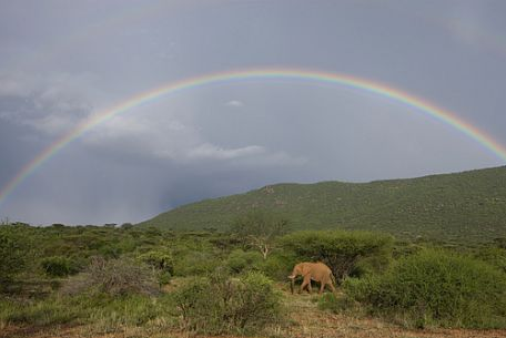
 7. Peter Lindbergh, 1996


Is it my favorite Pirelli year of all? Possibly. Lindergh shot in in the California desert, scene of many a fashion layout during the era, and pulled the curtain back to reveal the artifice that was at the heart of his narrative. This image featured model Eva Herzigova.

8. Herb Ritts, 1999


After seeing the Pirelli calendar spin off in so many different directions, Ritts took the pin-up back to traditional roots. On the beach in Los Angeles, he shot this photograph of model Laetitia Casta in a 1950s pose; the image, however, is entirely modern in its winking reference to the past.

9. Annie Leibovitz, 2000


In muted tones of creamy white and delicate blue, Leibovitz offered a study of the female form that focused intently on rich textures of skin. These were pictures you felt as much as saw.

10. Bruce Weber, 2003


Weber created what may be the calendar's happiest year, a romp filled with Italian beaches, villas, and vespas. He captured another kind of immortality, the kind he specializes in: youthful beauty. Heidi Klum, a big straw hat, and a wide smile. It's all there.

Monday, October 18, 2010

The New Journalism, 2010

The Associated Press has made a momentous decision—and no, I don't mean it's going to settle that damned dispute with artist Shepard Fairey over his 2008 Obama poster.

I'm referring the news agency's plan to drop the time-honored term "Associated Press Writer" in favor of the label "Associated Press." It's a reckoning with the reality that these days news reports and images are, more and more often, being filed by the same person, just as photographs and video are more and more likely to made shot by the same person (with the same camera). The old distinctions between reporters and image makers can hold up to the modern demands for efficiency and the modern opportunities offered by technology. Below is the memo AP sent to its employees announcing the change.


Colleagues,
After more than 80 years, we’re planning to retire the storied term “Associated Press Writer.”
Effective Oct. 26, our byline style for most writers will change from …
By JOHN SMITH
Associated Press Writer
… to the more platform-neutral:
By JOHN SMITH
Associated Press
These days, the byline on an AP story may rightfully belong to a text reporter, a photographer, a videographer or a radio reporter. For instance, photographer Aijaz Rahi bylined our coverage of a recent plane crash in India. Videographer Rich Matthews had his byline on Gulf oil spill stories. Some of our staffers have extensive multimedia skills and work with several platforms every day. Saying simply “Associated Press” focuses on the important thing: that the material is from an Associated Press journalist.
Many newspapers and websites already change “Associated Press Writer” to “Associated Press,” or simply use the AP logo. We already use the signoff “Associated Press” on radio and video reports.
The change will not affect special bylines like “AP Political Writer,” “AP Military Writer,” “AP Sports Writer,” “AP Business Writer” and others. When we say in a note at the end of a story that several people contributed to the reporting, we can still specify when useful that someone is a photographer, video journalist, etc. The underline “For The Associated Press” remains available for those situations that require it.
We will make this change effective after a series of advisories. Elvis and Reporters Workbench templates will be updated to reflect it.
The earliest example of “Associated Press Writer” that our archivists can find is from August 1927.  It was initially used for sports writers. The term was then more generally adopted, starting in 1928, as “Associated Press Staff Writer.”  By the start of 1929, “Associated Press Writer” was in general use.
Please let me know if you have any questions.
Tom
Tom Kent, Deputy Managing Editor for Standards and Production.

Friday, October 15, 2010

Photos of the Week: Chilean Resurrection

Orpheus descended to the underworld to save Eurydice, but his uncontrolled gaze sent her back  for eternity. And on and on. Our literature, our art, and of course our religion is filled with visions of resurrection, so it's no wonder that images of the rescue of 33 Chilean miners this week captivated us so. Like Orpheus, we could not help but gaze as they were pulled from below, one by one, in a coffin-like capsule. The great Big Picture blog of the Boston Globe has put together the best photos of this week's events; the following is a brief selection that underscore the old story at the heart of this story.

1. Darkness 

A nighttime view of the rescue effort. Photo by Ivan Alvarado/Reuters
2. Descent

A video capture of rescuers testing the rescue capsule. Photo AFP/Getty
3. Porthole

Workers look into hole as capsule is lowered on October 12/ Photo by Hugo Infante/Chilean Government via Getty Images
4. Underworld

A frame from video camera inside mine shows miner being lifted. Chilean Government Photo via Reuters
 5. Risen

A mounted camera records the perspective of the rescued during a test. Chilean Government via AP
6. Shadow

Rescued miner Alex Vega hugs his wife. Photo by Hugo Infante/Chilean Government/AP
7. Prayer
A resident of nearby Copiapo, Chile. Photo by Mariana Bazo/Reuters

Wednesday, October 13, 2010

The Lost Ansel Adams Negatives: 10 Essential Plot Points

A positive from a "lost" glass-plate negative
 That story about that guy who found the glass-plate negatives made by Ansel Adams in a garage sale has taken so many twists that I and most of the people I know have sort of lost track of it. All most of us remember is that the man paid next to nothing for them and now stands to make millions of dollars.
    If you'd like a quick refresher course, I suggest you watch the trailer for a proposed documentary about the discovery. It was prepared by the lawyer of the man who found the plates, and it has kind of "Law & Order: L.A." vibe. If you'd rather not, here is a brief summary:

Medium Shot: Security guard opens door of pickup truck. Man emerges carrying something. It looks like it might be a metal lock-box filled with money, jewelry, bearer bonds, or all three.
Cut To: Close-up of man putting on latex gloves. He opens box.  Urgent music. Words appear on screen: "An art world mystery..."
Cut To: A close-up of yellow crime-scene tape. Words on screen: "begins with a photography lab fire..."
Cut To: A series of antique-looking photographs showing wilderness scenes. Words on screen: "A school district painter..."
Cut To: A shot of several folding tables piled with old clothes and other junk.  Words on screen: "65 glass negatives from a garage sale..."
Cut To: Close-up of latex-gloved hands caressing glass negative. Words on screen: "A treasure worth millions?"
Cut To: Another series of prints made from the negatives. Words on screen: "Or just pieces of glass?"
And that, essentially, is that. If the trailer's visuals are a bit florid, at least the producers understood the nugget of drama at the heart of the story. Since last July, when it was announced that a man named Rick Norsigian had discovered glass-plate negatives with images taken by Adams in the 1920s, there has been only one real point of interest in the matter. And it isn't  art history.
"Ansel Adams photos found at garage sale worth $200 million," reported CNN after the announcement.
"California man paid $45 for glass negatives which may fetch $200 million," said the Today Show website.
"$200 million Ansel Adams negatives found at garage sale," said the trade website Photo District News.
The Catholic Online website actually did add historical perspective: "The items are the missing link in legendary photographer Ansel Adams' career—and they're worth $200 million," it explained.
Robert Louis Stevenson knew the narrative value off lost treasure, and its appeal has not diminished over the years. 
       It's true, of course, that the Norsigian story line has gone off in a few directions since the announcement of their discovery. The authentic origin of the glass plates has been called into question. And that $200 million figure? Well, maybe not. But we still want to know if someone found a treasure. Yes?


Rick Norsigian, as seen in the trailer for the proposed documentary
 Photo critic and historian A.D. Coleman is still interested in the story, that's for sure. His blog has become a kind of clearing house for information on the Norsigian drama, and he has been taking a lead in parsing out the truth about the glass plates, "snapping and snarling," as he puts it, over all the claims and counter-claims that have contributed to the "deepening mystery" (as per Britain's Mail Online) surrounding them. Did Adams really take the images on the glass plates? Or were they taken by a man named Earl Brooks, as his 87-year-old niece has claimed? Were the glass plates really authenticated before the July announcement was made? Or is it merely an intriguing tale that benefits from ponderous music and shots of crime-scene tape?
     I talked with Coleman recently, and he graciously walked me through those various complexities. Then he told me that the story might soon be getting even more complex. What if, he said, the images on the plates were made by neither Adams or Earl Brooks?
     "It might be someone else entirely," he said.  I'm working on it now. There's another contender out there who may be the creator of these negatives."

Tuesday, October 12, 2010

Comment and Correction from Jacques

I recently posted about the "new porn" as exemplified by a magazine named Jacques, and today I heard back from the publication's founder and photographer, Jonathan Leder. He took exception to my comparing his work with that of Richard Kern, and corrected a caption mistake I made:
Richard Kern?  Bad locations, ugly girls, tattoos.  Totally not our vibe . Also,  they lady in the car with me is my WIFE.  Have you heard of those?   And we have a Son.  Jack. Who the magazine is named after.  And another son on the way. 
 Sorry about that, Jonathan, and as per your suggestion that I do better fact-checking....point taken. Still think some of your pictures have the Richard Kern vibe, but I mean that as a good thing. Regarding the baby, mazzeltov!

Monday, October 11, 2010

Photo of the Day: The Men and Women Behind the Curtain

The current members of the U.S. Supreme Court, by Doug Mills for the New York Times
 We  take so may visual clues for granted. On TV and in pictures we see judges wearing black robes, but only rarely do we note with wonder that these officials,  alone in our government, wear costumes that denote their roles and their power.
      Tradition may demand it. But there is more: These people are our shamans. We have agreed, in some way, that they have special abilities allowing them to interpret law and divine its intent. They can see what others cannot. Our judges are not priests, of course, but the robes they wear suggest that the law, which may be based on rational thought, is enlivened by a spiritual yearning. We need to believe, and the judges need to be believed in.
     I like the portrait that Doug Mills of the New York Times made of the current members of Supreme Court, which begins its 2010-2011 term this month, because he has pulled away and shown us the visual construct surrounding our wise men (and now three women.)
      At least in this country we don't require or expect them to wear medieval accessories like wigs.

Thursday, October 7, 2010

Red Is the New Green Disaster

Seeing Red: Photo by Tomas Benedikovic/Isifa/ Getty Images
Does the color of a disaster matter? Yes, I think. The red sludge that has washed over dozens of villages in Hungary has provided photographers with a striking emblem—a color-coded warning about the dangers of toxic reservoirs, specifically, as well as an unmistakable sign of a more generalized fear for our world. 

     Natural disasters like mudslides are often horrific, but they usually come in earth tones. A mudslide that is red has another meaning entirely, one that we don't have to think hard about to understand. Seeing a picture like the one above, by Tomas Benedikovic for Isifa/Getty Images, is  enough. 
     It isn't surprising then that so many pictures have been turning up in portfolios on news websites. Here is a collection of six particularly effective shots gleaned from some of those sites. Each, in its own way, communicated fear and loathing, red and dread.

1. Beauty and the Burst

An aerial view of the damaged reservois: Photo by Sandor H Szabo/AP

2. Sludge Report 

A firefighter empties his boot: Photo by Lajos Nagy/EPA

3. Dead Planet
 
Near the village of Kolontar, Photo by Bela Szandelszky/AP


4. Air Presumptive

A Hungarian Soldier: Photo by Bela Szandelszky/AP

5. Crimson Side

High-water mark, October 5: Photo byWaltraud Holzfeind/Greenpeace/Reuters


6. Hue and Sigh

A resident rests: Photo by Tamas Kovacs/EPA


Wednesday, October 6, 2010

The Underwater Yeti, The Unknown Photographer, and The New Porn

The Yet Crab in all its glory
1. Say Hello to "Mr. Blobby"

Nearly three-quarters of the Earth is covered by water, as scuba diver Mike Nelson used to say at the end of each Sea Hunt episode, and we keep finding surprises down there, which is good for people who like to watch. Like me. The creature in the tack-sharp photo above is a Yeti Crab, found in a thermal vent about 1.5 miles below the surface of the sea near Easter Island. The Yeti Crab was one of 6,000 species discovered over the course of a 10-year international marine census that involved 2,700 scientists from 80 countries. Science, which often shows us what we can't see in our everyday lives, is a constant source of wondrous imagery. You'll agree that only a few can rock the white fur coat like this. Now consider the thing you see below.

The Fathead Sculpin fish
This is the Fathead Sculpin fish, or at least an example of the species that has been kept in a jar since its discovery near New Zealand in 2003. The deflation the specimen has suffered since then has left it in a state that tests our anthropomorphic urges. It has been affectionately nicknamed "Mr. Blobby" by researchers, though you might find it rather cute.


2. Who Shot the Magazine Cover of the Year?

You may well ask. The American Society of Magazine Editors named the winner of its "Magazine Cover of the Year" award yesterday, without naming the photographer who took it. Its a typical oversight from the organization, which celebrates the creative genius of editors and publishers while ignoring the paid help who actually create. (Just a photo credit in the press release would have sufficed, for goodness sake.)

The December 2009 cover, shot by Mark Seliger
 The winning cover, above, was from the December 2009 issue of Harper's Bazaar, and if you were to search the web long enough or if you had your own back issue you could find out that it was taken by the great Mark Seliger, best known for his celebrity portraits. His winning image—a beautiful shot of "Twilight" stars Kristen Stewart and Robert Pattinson—undoubtedly captured the hearts and minds of cultish"Twilight" fans, who voted for the cover on Amazon.com, which hosted the contest. (Here's a list of ASME's top magazine covers of the last 40 years, by the way, chosen by editors rather than Amazon devotees.)

3. Jacques Treatment

Last Sunday's New York Times ran a piece in its "Style" section about photographer Jonthan Leder, the creator of Jacques, which the Times described as "an upstart adult magazine in Brooklyn that reinterprets vintage Playboy in the age of 3D and GPS hookups."

The Times pointed out that to recapture the ambiance of pinup photography from back in the day, Leder shoots not digitally but on film. And it noted that Jacques magazine is part of a mini-trend of arty-erotica that includes Richardson, S Magazine, and Butt (it was worth buying the whole Sunday paper just to see the title Butt in the Times), but it could only show a very carefully displayed display of Jacques covers, which feature nudity. I have vowed to keep this blog free of porn, so I went to the Jacques blog and found the recent cover you see here.


Will Jacques make her a star?
From what I can see, Leder's imagery owes more to the likes of Richard Kern than to early Playboy; but if there isn't much new to the work, there is a sense of experimentation and, remarkably, a feeling of warmth and collaboration between photographer and models. Everybody here is in on the joke, as you can tell from this shot of Leder and model, made for the Times by Robert Wright. I've got to go now to buy a pair of those sunglasses.

Leder and model by Robert Wright