Thursday, August 26, 2010
Discovering Prokudin-Gorskii's Lost Empire
I'd never heard of Sergei Mikhailovich Prokudin-Gorskii until I encountered his photographs recently on The Big Picture, which is one of my favorite photo sites. (It really does have big pictures.) It goes to show that 1) my photo education has huge gaps to fill, and 2) surprises are always welcome in life. Now this photographer, who documented the vast Russian Empire between 1909 and 1912 ( and later in 1915), has jumped up toward the the top of my interest list.
When Prokudin-Gorskii convinced Tsar Nicholas II to sponsor a photographic survey of the Russian Empire, he (like the Tsar) probably assumed he was documenting a Great Power at its peak. From a modern perspective, the photographs paint a portrait of a lost world. The empire was already crumbling; the old regime would fall completely in 1917, and the Tsar and his family would die at the hands of the Bolsheviks in 1918.
The intrepid photographer travelled in a special railway car and documented 11 regions of the empire, according to this source. His work might be compared to the photographic surveys of the American west by William Henry Jackson, or the ethnographic studies of native Americans by Edward Curtis, who worked in roughly the same era. Prokudin-Gorskii, however, produced color images, ingeniously. He shot in black and white, and made three exposures of each image in rapid succession, each one with a red, green, or blue filter. The three different exposures would then be sandwiched together and projected with filtered lanterns to create his wondrous color images. This site has a nice collection of his images, and this one tells of their restoration. If anyone could recommend other good sources of information for me to look into, that would be just great.
Wednesday, August 25, 2010
Katy Perry's Three Lessons About People Magazine
I went ahead and downloaded the new People magazine app and spent $3.99 for the August 30th issue—the first available for my iPad. I thought it would be interesting to review it here, and to compare it to the print version. (The similarities, or dissimilarities, between the two is a big issue in the photo business these days. See below.)
Review
I liked reading the magazine on my iPad, very much, indeed. I thought it was one of the better looking, easy-to-navigate magazine apps I've experienced so far. The magazine's pastel backgrounds and celebrity pictures looked dynamic—more so than in print, where they achieve a different, trashier charm. There is a photo of Jennifer Aniston in the "Star Tracks" section (by Paul Buck, credited to the European Press Agency) that is modestly spectacular. It's a red-carpet photo taken at the Hollywood premier for Aniston's movie The Switch, and I usually find no interest in red-carpet photos. (They are the celebrity-photography equivalent of reality TV—a real moment, but not really real, because the celebrities are performing.)
You can't tell from the image as you see it here, but on my iPad, the Aniston photo has dimensional depth and the compositional interest of a very good studio picture, so it really stands out. I'm afraid my iPad made many of the photos in the issue look more interesting than they really are.
The iPad may be a perfect place for a magazine like People, with short articles that don't require much acuity on the part of the reader. (Didn't someone say that iPad mag apps were going to save long-form journalism? TBD.)
Review
I liked reading the magazine on my iPad, very much, indeed. I thought it was one of the better looking, easy-to-navigate magazine apps I've experienced so far. The magazine's pastel backgrounds and celebrity pictures looked dynamic—more so than in print, where they achieve a different, trashier charm. There is a photo of Jennifer Aniston in the "Star Tracks" section (by Paul Buck, credited to the European Press Agency) that is modestly spectacular. It's a red-carpet photo taken at the Hollywood premier for Aniston's movie The Switch, and I usually find no interest in red-carpet photos. (They are the celebrity-photography equivalent of reality TV—a real moment, but not really real, because the celebrities are performing.)
![]() |
| Aniston by Buck: It's better on an iPad |
The iPad may be a perfect place for a magazine like People, with short articles that don't require much acuity on the part of the reader. (Didn't someone say that iPad mag apps were going to save long-form journalism? TBD.)
Monday, August 23, 2010
The Five Top Marilyn Look-Alikes
![]() |
| Marilyn by Eve Arnold |
...she knew she was superlative at creating still pictures and she loved doing it. She didn't have to learn lines as she did for her movies, she could let her imagination range freely....It was always her party and often there would be champagne and music, but always total attention. It was she who in essence was saying, 'Let's make Marilyn.'
When I was the editor of a photo magazine, it was pointed out to me many times that I indulged my fascination with Marilyn perhaps a bit too much. I plead guilty and continued on with special Marilyn issues and whatnot. There were two reasons for that:
1) I never got tired of looking at pictures of Marilyn and trying to figure out what qualities made them so compelling, and
2) The readers of the magazine also found her fascinating. She always sold well.
She was so compelling, in fact, that long after her death young actresses continue to establish their own claim to commercial and cultural immortality by being photographed as Marilyn. Being Marilyn is a coded message that, when decoded by viewers, says "I'm a star"—a sort of Hollywood rite of passage. The faux-Marilyns have appeared on magazine covers, in ads for perfumes, and in music videos, all of which used the imagery as coded messages that, when decoded by potential shoppers, say, "This is glamour." I assume that in all these instances the products sold well.
I mention this because the Huffington Post included a poll last week inviting readers to vote for "Who Makes the Best Marilyn." (Apparently there are rumors that a Marilyn biopic is in the works, and the lead role has yet to be cast.) The last time I looked, these were the top five choices.
![]() | |
| Angelina Jolie as Marilyn |
![]() | ||
| Scarlett Johansson as Marilyn |
![]() | ||
| Drew Barrymore as Marilyn |
![]() |
| Madonna as Marilyn |
![]() |
| Christina Aguilera as Marilyn |
By the way, here's a trivia question you can ask people: What was the first magazine cover the real Marilyn appeared on? According to my wonderful former colleague Carol Squiers, now a curator at the International Center of Photography, the future sex goddess appeared on the April 26th 1946 issue of that heartland favorite, Family Circle.
Saturday, August 21, 2010
Gimme Rewrite, Sweetheart...
My friend the Pulitzer-Prize winning photojournalist David Kennerly shared a recent news story in a Facebook comment today:
Is it the worst news story lead ever written? It's in the running, for sure. David (left) himself suggested that the writer "bear-ied" the lead. But seriously: As an editor, what do you do with a lead that wanders over so much ground? You can write too tight, for goodness sake. I read it and felt like I was on the most perplexing freeway on-ramp in Los Angeles.
How would a great newspaperman rewrite that lead? The journalist Joe Galloway kindly offered an alternative lead as a comment to Kennerly's post...and remember, this comes from a man who covered the Vietnam War and later wrote the book We Were Soldiers Once, and Young, about the1965 battle of Ia Drang in the central highlands (it was turned into a Mel Gibson movie, when Mel Gibson movies were still pretty good). Galloway also covered the India-Pakistan war of 1971 and became a correspondent for U.S. News & World Report, so he knows what he's doing. Here's his version of the bear story:
All you journalists and writers out there...Galloway has just given you a short master class.
COLUMBIA STATION, Ohio (Aug. 20) -- A bear fatally mauled its caretaker during a feeding on property holding dozens of other exotic pets owned by a man who drew the wrath of activists—and lost his license to exhibit —after offering people the chance to wrestle bears at a Cleveland expo.
Is it the worst news story lead ever written? It's in the running, for sure. David (left) himself suggested that the writer "bear-ied" the lead. But seriously: As an editor, what do you do with a lead that wanders over so much ground? You can write too tight, for goodness sake. I read it and felt like I was on the most perplexing freeway on-ramp in Los Angeles.
How would a great newspaperman rewrite that lead? The journalist Joe Galloway kindly offered an alternative lead as a comment to Kennerly's post...and remember, this comes from a man who covered the Vietnam War and later wrote the book We Were Soldiers Once, and Young, about the1965 battle of Ia Drang in the central highlands (it was turned into a Mel Gibson movie, when Mel Gibson movies were still pretty good). Galloway also covered the India-Pakistan war of 1971 and became a correspondent for U.S. News & World Report, so he knows what he's doing. Here's his version of the bear story:
Some days you eat the bear. Some days the bear eats you. Friday it was the bear's turn...
All you journalists and writers out there...Galloway has just given you a short master class.
Thursday, August 19, 2010
485 More Words on Herman Leonard
![]() |
| Courtesy Fahey/Klein Gallery |
Like his close friend, Quincy Jones, Herman Leonard’s persona was the definition of “cool.” At 87 years old he was more hip than most 25-year-olds. His photographs defined the era when jazz blossomed in America and became a true, original art form in our collective consciousness. Herman’s photographs are a record in the history of this genre of music. The photographs were honest, forthright, and expressive, like jazz music. Often when I hear the music, I think of Herman’s photographs. Like our best documentary photographers, he effectively captured the spirit and soul of his subject matter. In vivid detail, his pictures show us a compelling story of the characters, the places, and the time. He was particularly adept at capturing the drama of performers on stage—whether it be his subject's strength, or vulnerability. Herman’s photographs are exceptionally rich and detailed, and they faithfully describe the atmosphere of the moment. His photographic style—where the light, density, and texture of his photographs are profound and striking—is instantly recognizable. His photographs are a poetic mingling of expression, emotion, and atmosphere. Early on, Herman knew how to create myth-making photographs that will continue to endure.
One of the things I found most interesting about David's words was the linking of Leonard to the tradition of documentary photography. Leonard's work also springs from a background in portraiture—he apprenticed for Yousuf Karsh, no less, and later found his own subject.
![]() |
| Courtesy Fahey/Klein Gallery |
![]() |
| Courtesy Fahey/Klein Galler |
Leonard wasn't the only photographer to do so. Life magazine's Gjon Mili made a little masterpiece of a film called Jammin' the Blues that also captures jazz artists in expressionistic black and white.
But Leonard did it without the advantage of movement and sound, maybe that's why his still images are so wonderful. He caught a sense of peak moment. The drama of the light, the frozen movement of cigarette smoke or gesture...all this tells us that we are seeing something real, and that we are seeing it in an instant of perfection.
Wednesday, August 18, 2010
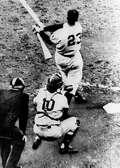
Bobby Thompson 1923-2010
![]() |
| The Shot Heard 'Round the World |
—Russ Hodges, New York Giants Announcer
On Sunday mornings in New York, there is a weekly radio show about baseball on WFAN hosted by Ed Randall, who says in his standard introduction that baseball is "the only game you can see on the radio." Do you agree? Very often, I think, great news moments are immortalized visually—especially in still pictures. Photographs sum up experiences instantly and etch them deeply into memories in a way that other media don't. But of course there are moments we know best from other media, and Russ Hodges's call of Bobby Thompson's "Shot Heard Round the World" is one of them. Still photos of the moment, like the one above (
Maybe this is all a matter of technology—radio was fully formed in 1951, while photography was a still few years away from the 35mm cameras and motor drives that would revolutionize sports photography and make a magazine like Sports Illustrated must-reading for fans. As for television, it would be several decades before high-quality images, instant replays, and 24/7 highlight clips became standard viewing expectations.
But I think I agree more with Ed Randall: Baseball, spread out over a vast area, complex in the implications of every play, was and is still best seen on the radio, where skilled announcers paint the images in our minds. Boxing is a photographic sport; the punch is never as compelling as the aftermath of the action. Football is a television sport, with bodies and movement seen in a rolling, roiling storyline. Hockey...well, you have to be there. (I take that back, considering this clip, the only call that might rival Hodges's in the annals of sport. Here, the picture and the words belong together.) Baseball belongs on the radio.
What do you think? Here's another question: What do you think the best sports call ever was?
Tuesday, August 17, 2010
Herman Leonard 1923-2010
![]() |
| Dexter Gordon, Date Unknown |
The great photographer of jazz artists was 87. My favorite quote about Leonard came from Quincy Jones: "I used to tell the cats that Leonard did with him camera what we did with our instruments....Herman's camera tells the truth and makes it swing." Everything you need to know about Leonard as a portraitist can be found in his famous image of Dexter Gordon: Mood, expression, detail, and smoke...lots of smoke.
Subscribe to:
Posts (Atom)